If you’ve ever wondered why some artworks instantly captivate while others feel unbalanced, the answer often lies in color theory in art. Whether you’re a beginner experimenting with paint or a seasoned creator refining your style, understanding how colors interact can transform your work from ordinary to striking.
This article is designed to help you master the foundations and creative applications of color theory in art, from choosing harmonious palettes to using contrast for emotional impact. We’ll break down essential concepts, explore practical techniques you can apply right away, and highlight modern trends shaping today’s artistic expression.
Our insights are grounded in established artistic principles, hands-on crafting experience, and analysis of current creative trends across diverse mediums. By the end, you’ll have clear, actionable strategies to make smarter color choices and elevate every project you create.
Unlocking the Power of Color in Your Art
Color shouldn’t feel like CHAOS. Yet many artists treat it that way—grabbing tubes at random and hoping for magic. Let’s fix that.
Most guides stop at the wheel. We go further, showing how color theory in art becomes a decision-making SYSTEM, not trivia.
- Map emotion first (What should viewers feel?).
- Choose a dominant hue.
- Build contrast with complementary or analogous support.
- Adjust saturation before adding detail.
Think of it like directing a film—every shade has a role. Why let background colors steal the spotlight? Use color intentionally, and your story sharpens instantly.
The Language of Color: Decoding the Color Wheel
“Wait, so red and blue make purple… but why does it feel different when I mix paint versus digital?” a student once asked. Great question.
Let’s start simple. Primary colors—red, blue, and yellow—are the building blocks. Mix two primaries and you get secondary colors (green, orange, purple). Blend a primary with a neighboring secondary and you create tertiary colors like blue-green or red-orange. Think of it as a family tree (with fewer awkward reunions).
Now layer in three essential dimensions: hue, saturation, and value. Hue is the pure color—what you’d call “blue.” Saturation measures intensity, from muted gray-blue to electric cobalt. Value describes lightness or darkness. “If you change the value,” an art instructor told me, “you change the mood entirely.” She’s right. A dark crimson whispers drama; a pale pink feels airy.
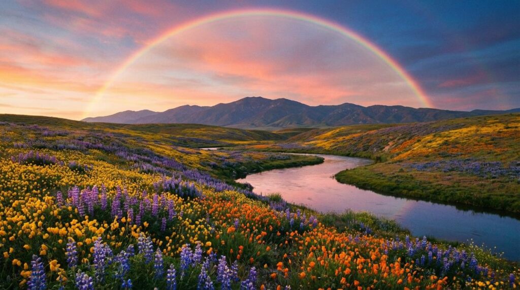
Temperature matters, too. Warm colors (reds, yellows, oranges) advance visually, while cool colors (blues, greens) recede. Landscape painters rely on this to create depth—cool mountains in the distance, warm fields up front. It’s a core principle of color theory in art.
Some argue rules limit creativity. But understanding them doesn’t box you in—it gives you control (like knowing scales before jazz improvisation). Pro tip: adjust value first when a palette feels “off.”
From Chaos to Cohesion: Mastering Color Harmonies
When it comes to building a palette, understanding color theory in art can feel like stepping into a paint-splattered laboratory. Yet once you compare schemes side-by-side, the chaos starts to organize itself.
Monochromatic vs. Analogous: Subtlety or Soft Variety?
A monochromatic scheme uses one hue (a pure color) and varies its saturation (intensity) and value (lightness or darkness). Think of a room styled entirely in shades of blue—from pale sky to deep navy. The result? Cohesive, calm, and quietly sophisticated (like a minimalist wardrobe that somehow always works).
By contrast, analogous schemes pull from neighboring colors on the wheel—say blue, blue-green, and green. This creates gentle contrast while staying harmonious. If monochromatic is a solo performance, analogous is a duet: still smooth, just more dynamic.
Complementary vs. Triadic: Drama or Balance?
Now, if you want impact, complementary schemes pair opposites like red and green. Because they sit across the wheel, they create maximum contrast. That tension grabs attention immediately—great for focal points or bold branding (think classic superhero costumes).
On the other hand, triadic schemes use three evenly spaced colors, such as red, yellow, and blue. The balance feels energetic without overwhelming the viewer. It’s vibrant but controlled.
Some argue high-contrast palettes are too loud for refined design. Fair point. However, when used intentionally—say, one dominant color and two accents—they become powerful rather than chaotic. Pro tip: let one color lead while the others support.
Ultimately, your choice isn’t right or wrong—it’s about mood, message, and how boldly you want to speak visually.
Beyond the Wheel: Using Color to Tell a Story
Color isn’t decoration—it’s direction. When you understand the psychology behind it, you gain the power to shape how viewers feel before they even process what they’re seeing (yes, it’s that fast). In color theory in art, hues carry emotional weight. Blue often signals calm or trust—think hospital walls or corporate logos. Yellow radiates energy and optimism (McDonald’s golden arches aren’t an accident). Purple leans mysterious or luxurious, long tied to royalty because of its historical rarity (Smithsonian Magazine).
When you use color intentionally, you don’t just paint—you persuade.
Creating a Focal Point
A single saturated color in a muted composition acts like a spotlight on a stage. Our eyes are biologically drawn to contrast (Livingstone, Vision and Art). Add a red umbrella to a gray cityscape and suddenly there’s a story. The benefit? You control where viewers look first, second, and last.
- Use complementary colors for high contrast.
- Keep surrounding tones subdued.
- Limit your brightest hue to one key area. (Pro tip: If everything pops, nothing pops.)
Building Atmosphere and Depth
Atmospheric perspective means distant objects appear cooler, lighter, and less saturated. Landscapes use this constantly—mountains fade into bluish haze as they recede. By applying this principle, you create believable space and mood.
The payoff is huge: more immersion, stronger storytelling, and artwork that feels alive rather than flat. For more insight into how artists communicate visually in public spaces, explore street art styles and their cultural impact.
Master color, and you master emotion, focus, and depth—all without saying a word.
Practical painters know that better mixing means better results. Here’s how to upgrade your palette:
- Skip plain black for shadows. Instead, mix complementary colors to build rich, dimensional darks rooted in color theory in art. This keeps work vibrant, not muddy, and gives you lifelike depth collectors notice.
- Limit yourself to three or four tubes. A restricted palette strengthens decision-making, speeds workflow, and guarantees harmony across the canvas (less chaos, more control).
- Create tiny color studies before starting. Testing swatches saves materials, reduces frustration, and boosts confidence.
Pro tip: label mixes for repeatable magic. Your paintings will feel intentionally cohesive.
Start Creating with Color Confidence
Color isn’t decoration; it’s direction. Some argue great art should be intuitive, that studying color theory in art limits creativity. But structure doesn’t cage expression—it sharpens it (like learning chords before improvising jazz).
You now have a roadmap:
- Harmony to create unity
- Value to control contrast
- Temperature to guide emotion
Skeptical? Try this: choose a complementary or analogous scheme and paint a small sketch. Notice how intention replaces guesswork. When you control color, you control mood, focus, and impact. That’s not restriction—that’s creative power. Start today and trust your evolving eye. Fully.
Bring Your Creative Vision to Life
You came here looking for fresh inspiration, practical techniques, and creative buzz you can actually use in your own projects. Now you have new ideas, smarter DIY material hacks, and a clearer understanding of how color theory in art can elevate every piece you create.
The real frustration isn’t a lack of talent — it’s feeling stuck, uninspired, or unsure how to take your craft to the next level. When you understand trends, experiment with new techniques, and apply artistic expression styles intentionally, you stop guessing and start creating with confidence.
Don’t let half-finished projects or creative blocks hold you back. Explore more step-by-step guides, try one new technique this week, and put these insights into action. Join thousands of passionate makers who are already transforming their ideas into standout pieces. Dive into the next project now and turn your inspiration into art you’re proud to share.
 Wesley Phamantons